1. I believe the strongest aspect of my work is my use of lines and that is what I put a lot of effort towards when I take a picture.Usually directional lines leading the eye to move around the page.
2. My angles as they are usually straight on and it is hard to see the texture.
3.Finding places with texture as everything has texture if you look at it the right way.
4. Getting the light right with each picture as the sun does not like to be where I would want it to be.
5. I mostly used the quick selection tool a lot as I found it is the the quickest way to go over something. I also used color contrast to change the colors of certain areas
6. I used symmetry well and changed the color of certain objects to create contrast.
7. No
Tuesday, March 22, 2016
!3 things that represent me
 London where I lived
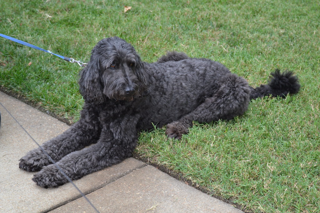
 My do
My doMonday, March 14, 2016
Thursday, March 10, 2016
Texture
smooth texture
rough and spongy
prickly
1.What is the strongest aspect of your work? Why?
2.What aspect of your work can be improved on? How?
3.What was easy about this art activity? Explain.
4.What was difficult about this art activity? Explain
5.What tools did you use in Photoshop to edit your images? How did you use them? Be Specific
6.How did you demonstrate the objective in this art activity?
7.If you could do this art activity again, what would you do differently
1. The strongest aspect of my work is the rule of three. I look to incorporate this in every picture as it can make or break an image.
2. I can work on my use of implied line to help the viewer experience the whole picture. I could do this by figuring out which area of the picture is brightest and trying to create lines moving your eye around the screen
3. The easiest part was finding the places for these pictures as it was a nice day and it was fun to snap these pictures
4. Photoshopping the picture so the viewer could see the texture easier. It was not easy lighting up the trunk of the tree without it looking abnormal.
5. I used the quick select tool then used color contrast/level to make the water bluer on the lake.
6. By showing texture on the closest object and making lines lead to the points I want the viewer to look at.
7. No
Thursday, March 3, 2016
Subscribe to:
Comments (Atom)
 after
after before


